The digital healthcare platform - Android
TeleClinic GmbH | Android appProblem
In a digital era where every answer is one online search away, people with health concerns find themselves turning to Dr. Google in their quest for medical advice. This seems to be the fastest and easiest way for anyone that does not have the time or energy required to get an appointment and sit at the doctor’s office for hours. However, in a sea of countless articles and forums flooded by self-proclaimed doctors, how can people trust that the information they read online is reliable? How can they safely self-diagnose their issues without wrongly matching their symptoms to some incurable disease?
Solution
TeleClinic is a digital platform that connects patients and doctors by web or mobile app. Users can directly call doctors via phone or videocall from anywhere, at anytime. They can also use the platform to safely store their medical files and share them with the medical staff. They can also use the platform to safely store and share their medical files, as well as get to know more about the people caring for their health.
Business goals
When I first joined TeleClinic, they already has a working product and a clear vision of all its features. So before starting on any research or analysis, I first had to get familiar with the vision of the company and its business goals.
TeleClinic strives at becoming the one stop health solution for its patients by giving them access to all relevant parties of the healthcare system. It wants to be the first thought that pops into a person’s mind when faced with a medical concern.
To do so, it relies on a set of benefits to give patients better control over their health:
Provide immediate, competent & personal consultation by German physicians with different medical specialties
Provide guidance to patients on which steps to take next and where to receive the best treatment
Provide a secure location for all patients’ medical data which they can access at any time and place
The business strategy of TeleClinic marketed its service towards German health insurances as their main customers (B2B solution) who would in turn offer the product to their existing insurants.
Product structure
Understanding the business goals helped me understand what the concept of TeleClinic really was, where it came from and where it was heading towards on the long run. The next step was for me to understand the complex structure of the product itself. To do so, I had to dive deep into the existing product and understand all the features it provided.
At first, I got ahead of myself and into too many details by trying to keep in mind all the different functionalities and constraints of each feature such as when a user could or couldn’t delete a file. When I realized that, I took a step back and focused on the goal of each feature in order to get a big picture view before diving into the specifics later on.
The product consisted in 5 features:
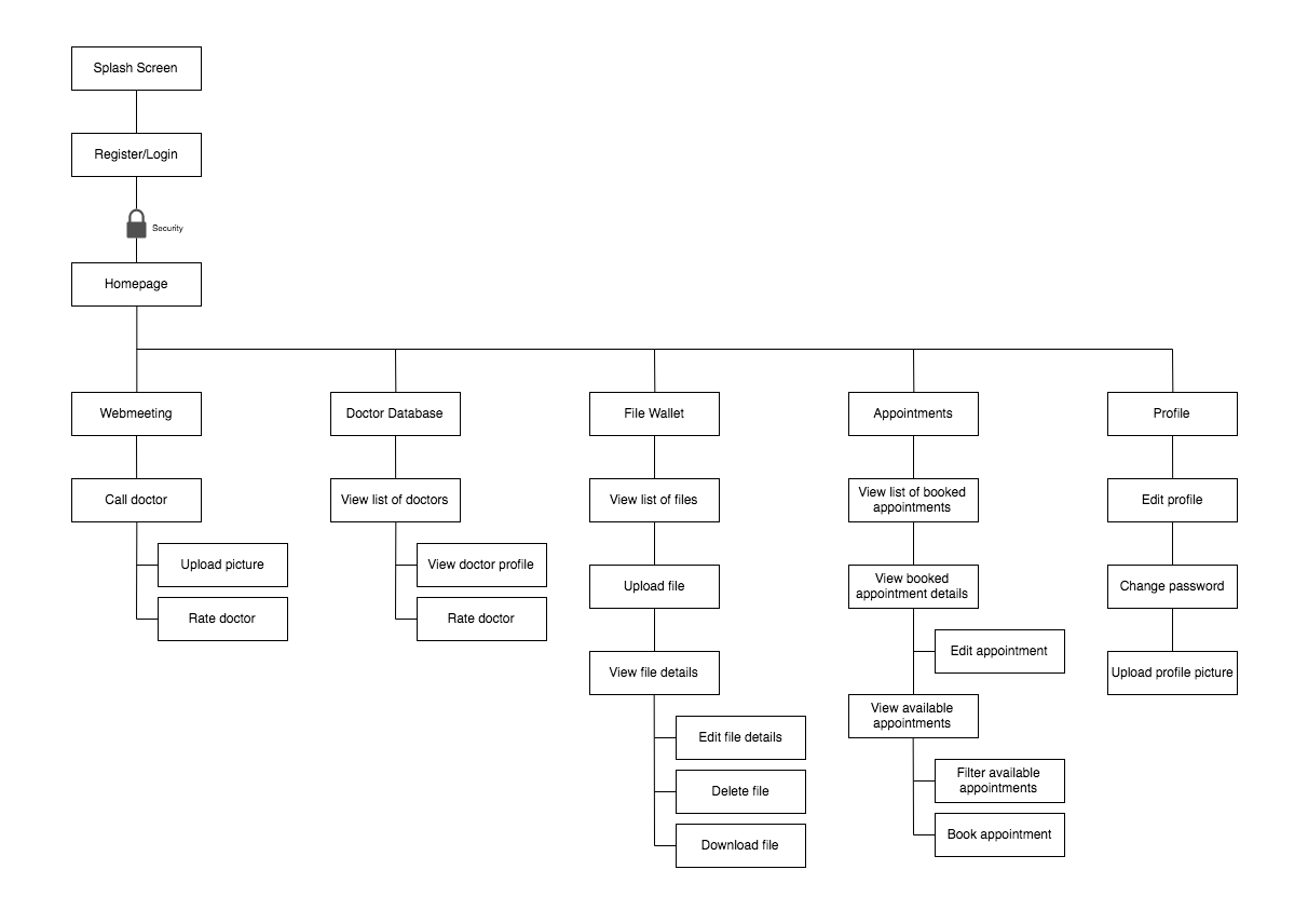
The “Webmeeting”: allows users to call TeleClinic and get connected to a doctor. Users can upload a file during the call.
The “File wallet”: secure location for users to upload their medical documents and images. Users can edit, download, delete and view the files.
The “Appointment”: users can browse through the list of available time slots and filter the results according to their needs (time, specialty, doctor). Users can view their booked appointments and edit or cancel them.
The “Doctor Database”: Users can browse through the list of doctors working with TeleClinic and view each doctor’s profile.
The “Profile”: Users can fill out their profile with their personal information and contact details. Users can upload a profile picture to personalize their account.
Personas
The next step was getting to know more about TeleClinic’s target audience. For this step, I relied on the personas defined by my marketing colleagues. The creation of those personas was based not only on competitive research, but also on user research and input from customers (health insurances). Getting to know more about the target audience helped us identify the user needs for a trustworthy, simple and flexible solution that can be easily integrated in their daily life.
Competitive research
Although digitalization has taken most of our daily lives by storm, digital healthcare solutions that go farther than the usual self-tracker are still trying to prove themselves and cut through the traditional habits of medical processes. The German healthcare sector also remains quite traditional and has only recently started seeing a growth in telemedicine solutions. Before starting on the redesign process, I conducted a competitive research to know more about the other telemedicine products on the market and what they offered.
For this research, I did not limit myself to the German market. Instead I looked into the apps available both locally and internationally, and analyzed how they answered the needs of their users. The two main competitors were Doctor on Demand and Meedoc.
Doctor on Demand
Doctor on Demand only operates in the US and was taken into consideration for the research given its reputation and status in the global digital health market. The app presented a simple UI, similar on both their iOS and Android apps. The app focuses on the consultation (videocall or appointments) and did not provide any further features such as a file management system. It also presented users with several informational screens under each sections detailing their process, the diseases treated and their pricing. Although very informational, this made the app feel a lot like their website and did not feel personal or intimate.
Screenshots of Doctor on DemandMeedoc
Meedoc was considered a direct competitor for TeleClinic given their presence on the local German market (Note: Meedoc have since changed business strategy and closed their service to the public). The features offered by the app included videocall and file storage. Comparing TeleClinic to MeeDoc, both services offered very similar features, although I could see that Meedoc was putting all the user’s attention on their videocall feature making the other features seem secondary. This gave a feeling of Meedoc being a Skype-like app to talk to a doctor. This was a characteristic that TeleClinic did not want to project as they did not want their service to end up renowned for being “another” call center.
Another very important distinction is the fact that MeeDoc marketed its service as paid by the users (B2C solution) which directly gave an advantage to TeleClinic which was mainly targeting German insurances. This difference in strategies turned out to be extremely important in the German market where patients are not so eager to pay for extra services since they were already paying for insurances that covered the majority of health services.
Screenshots of MeedocApp Site Map
Keeping the target audience in mind, I sketched out the application site map to ensure the organization of the pages and a smooth app navigation. This was especially important to keep track of all the functionalities and make sure to include the actions relevant for each feature.
Wireframes
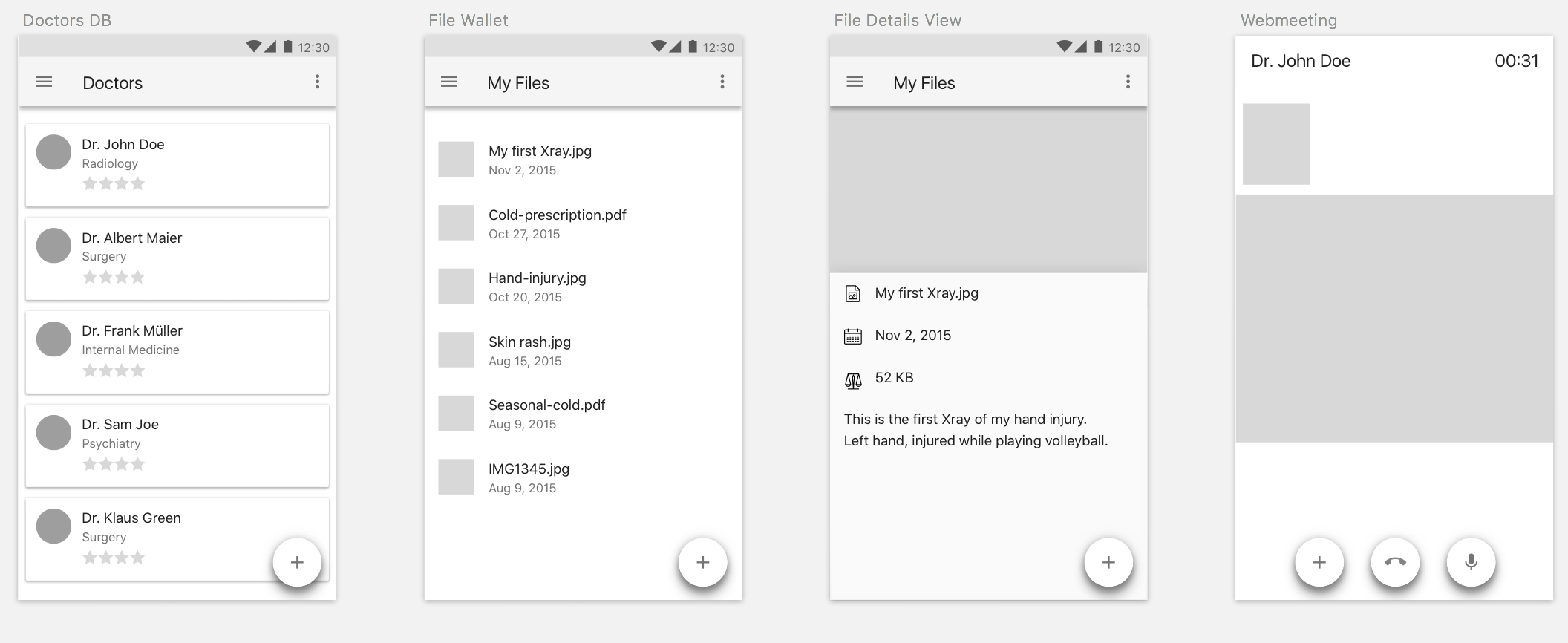
The next step was the creation of low-fidelity wireframes. I used those wireframes to think through the structure of the app and get feedback from the rest of the team before moving to high-fidelity mockups. This process went through several iterations based on the feedback. Sketching the wireframes on paper was extremely helpful because it allowed for faster iterations, and it also allowed me to truly focus on my ideas without having to think through a monitor.
Initial paper sketchesWireframes for Doctor DB, File Wallet and WebmeetingHigh-fidelity mockups
After the iterations on the wireframes, I moved on to create high-fidelity mockups. The mockups were then my deliverables and were used by the Android developer with whom I worked closely to provide any extra design feedback or iteration that came up during the implementation of the app. The mockups were also sometimes used to get feedback on the service from investors and health insurances.
To further reinforce the different features offered by the app, one design requirement was to allocate a color for each. For this purpose; I generated a color scheme based on the primary turquoise color that was already defined by the company’s branding.
TeleClinic brandingTeleClinic color schemeTo ensure a native Android app, the visual design of the app was primarily based on Google’s Material Design guidelines. I made sure to study the guidelines and also check how they were applied in other apps as a reference during this process.
Learning
Getting to know the vision of the company and thinking from a user’s perspective simplified the design process as it helps bridge the gap between the business goals and user needs.
While the whole project was a great learning experience, I especially liked sketching and going through the iterations for the wireframes. Being able to put my thoughts on paper and get feedback from the rest of the team really helped me change perspectives and tackle any ambiguity with the design. This made me realize the importance of getting feedback from people with different background and opinions.
The TeleClinic Android app has been live since May 2016 and has since been downloaded over 1400 times and enjoys a Google Play rating of 4.56 (data from April 2017). The overall project is still ongoing as the app gets regular feature and interface updates to support new product requirements and ensure continuous digital healthcare for its users.


